Tableau Certification Exam Questions - Part 8

This question is Part 8 of our free series of questions along with step by step video and Text based solutions for Tableau Certification Exam Question Dumps including Tableau Desktop Specialist Certification Exam Dumps and Tableau Desktop Certified Associate Exam Dumps. You will see similar questions in both above mentioned certification exams. In Specialist Exam you can expect 8 to 10 scenario based questions where as in Associate exam, it’s almost double. We strongly recommend to have a walk through such material before your real exam. All data sources used in these questions are available in Data Source Page at our website Menu.
Question AH
Use SPCL_Sample-Superstore-Subset Using Orders, and Returns sheets, Analyze the yearly sales returns data for region wise customer Segments to identify the customer segment which has decreasing trend of percentage of returns for that customer segment in that particular region.
Solution Concept
This questions focuses on your strength of analyzing the question, you need to find the decreasing trend of sales percentage across different years across region and customer segment. Catch in this question is to set the compute level for quick table calculation.
Results coming from quick table calculations are directly impacted by computation level which you set for quick table calculation.
In this question, we have to set this level to Pain (Down) in order achieve the result across region and customer segment.
Note: if you want to practice this question on your PC, you can download the data source from data sources page from our website menu.
Percent of Total is a Quick Table calculations, which gives you contribution in terms of percentage for a particular dimension in comparison whole. You can continue your learning journey and can read the following article from Tableau knowledge base.
Watch Video Based Question Explanation and Solution
Text Based Solution

It will open a new blank workbook like following

Click on Connect to data

From following screen click the Excel data source option.

It will ask the location for the data source available on the system, select the correct data source file and load it, Once you select the excel data source file from your local PC, it will be loaded in the Tableau and will look like as following

Select Orders Sheet and drop in the data pane

Its data will be visible and will look like this
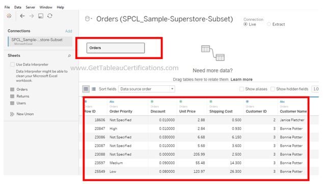
Since in the question, it is asked to calculate the answer using the Order and Return sheet so let us select the return sheet and drop in the data pane
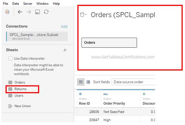
When you drop the Return sheet on to the data pane, it looks like this.
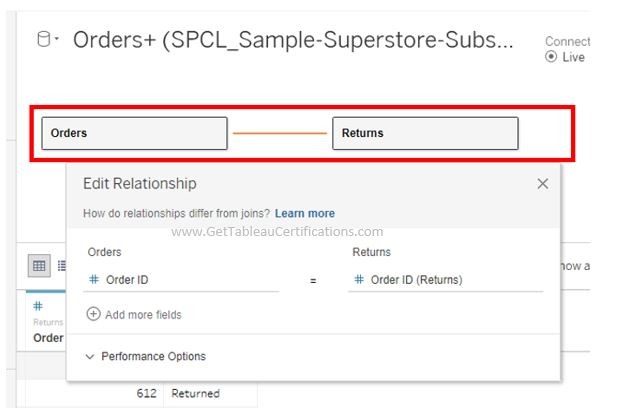
Edit relationship dialog box is open by default and shows the default join columns.
It selects Order ID as both columns have same name and data type so Tableau considers it the most suitable column for joining both Orders and Returns sheets

Once join is established, your data pane looks like this. Tableau automatically gives it a name, which you can change as per your business need.

It will be connected as follows and your sheet will look like this

Click on the sheet icon to create a new sheet as shown below

New Sheet will open like this

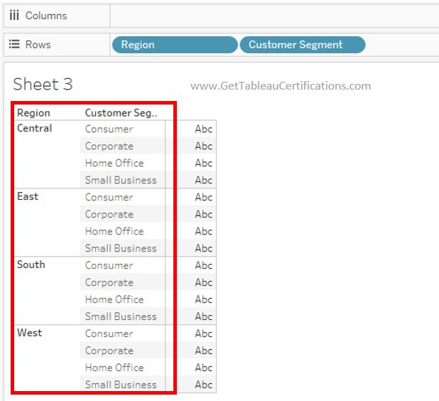
Select the Region and drag it to Rows Shelf

Sheet will look like this

Now select Customer Segment field and drag on to Rows shelf
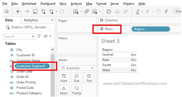
Sheet will look like this
Now select Order Date and drag it to columns shelf
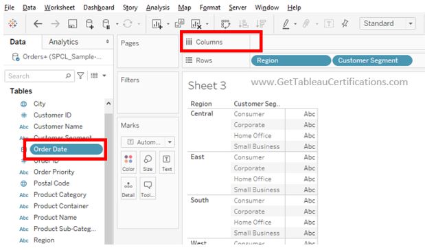
Sheet will look like this

Now select Sales measure and drag onto the Columns shelf as shown below

Sheet will look like this

Drag the Status filter and put on the filter pane
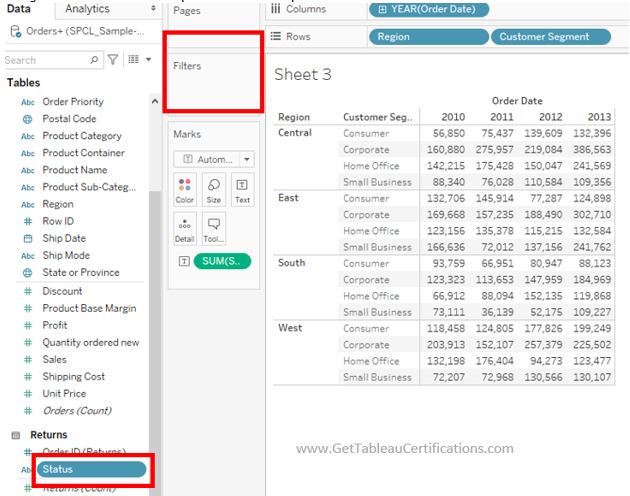
Select the filter value ‘Returned’ from the given options as shown below. So it shows only the sales return values.

Sheet will now look like this

It can be clearly noticed that before putting the filter, sheet was showing sales value against every customer segment in every year.
After putting the Status filter, it is now showing only the Sales returns figures, once we are sure that we are working on returns values now select the Sales measure and drag it to columns shelf

It will show the data in forms of bars, bar graph is always a handy chart when you want to see the trend or compare different values. Sheet look like this
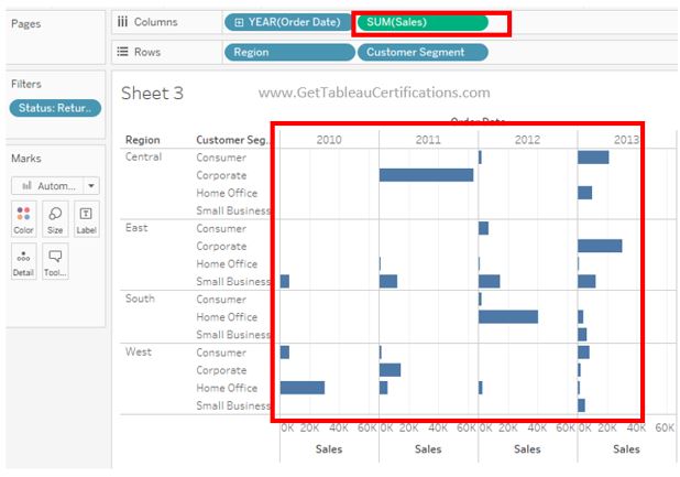
Select Sales measure and follow the navigation shown below to select the quick table calculation, ‘Percent of Total’ as shown below

It will show the small arrow on the Sales pill showing that it is a quick table calculation. Now enable the Labels by selecting the sales pill as shown below

Select Enable Marks

We can be able to see the values of percentages across each bar

Tableau sets the compute level property as per its own understanding of data, so by default Tableau has set the compute level property to Table Down.

segment in that region.
We shall make the compute level Pane (Down) so that Quick Table Calculation performs the computation on the data for that region and customer segment.
Let’s Whereas our requirement is to find the decreasing trend of percentage across customer now change the compute level from Table (Down) to Pane (down) as shown below

Sheet will look like this

If we analyze the data, it can be clearly seen that we can compare the percentages which are showing the increasing and decreasing trends for customer segments in their regions.
Though there are few customer segments which have sales returns percentages in decreasing trend but there is only one customer segment Small Business in East Region which has values of percentage of sales returns in all years and it is in decreasing trend as well.
So most feasible candidate for solution is Small Business in East Region as shown below

Related Links
For More Similar Video and Text Based Solutions – Click Here
